
Lecture : How does scholarship in DH expand what we consider as evidence and how does we use evidence in new ways? What are the methodologies (quantitative and qualitative) and workflows which result? [slides]
Reading: Orford, Scott, Danny Dorling, Richard Mitchell, Mary Shaw & George Davey Smith. 2002. Life and death of the people of London: a historical GIS of Charles Booth’s inquiry. Health & Place 8(1). 25–35. https://doi.org/10.1016/S1353-8292(01)00033-8. [pdf]
Tutorial:
Actvity 1:
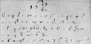
Many scholars have used the writing of Samuel Pepys as a data source. Visit the online version of Pepys diary, look at the entries for ten days and make a list of the different places Pepys mentions. Compare your results with others in the class – how much geographic variety was there in Pepys’ life? Take a look at the Map of Early Modern London and try to find some of the locations. Do the same with Google maps – how much has London changed over four centuries? (You also might like to compare the Pepys Diary site with MoEML in terms of ease of navigation.)
Activity 2:
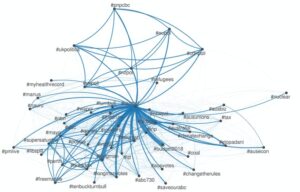
One of the methods used by many scholars today is network analysis and this exercise will introduce you to the basic ideas of this procedure. First, we will assemble some data ourselves and create a network visualisation from it, then we will look at a more complex network using prepared data.
Open this Google sheet and add some data: your name (you can use a pseudonym if you want), three different kinds of food that you like, and three different kinds of music that you like. Each name – item pair should be a separate row in the sheet as with the example data. When we have all added data, select and copy the two data columns. Go to ConnectTheDots, select paste rows from the options in the centre of the screen and paste the data from our sheet. The click on GRAPH and wait for the result. What we see will almost certainly be a not very coherent network, but nevertheless explore it using the information to the right of the graph – hovering over an item in the list highlights the corresponding node in the graph and vice versa. Look at the definitions of Degree and Centrality – can you see how these are reflected in the graph for particular nodes?
The data in columns F and G of the Google sheet are matches in the men’s draw of the 2020 Australian Open Tennis tournament (excluding the first round – ConnectTheDots didn;t like round 1 for some reason). What do you think a network diagram of a tennis tournament would look like? Which node(s) would be most central? Think about these questions and then copy the data from the Google sheet to ConnectThe Dots and graph them. Is the result what you expected?
If you want to explore network analysis in more detail, Gephi is a free software package which has advanced capabilities for this purpose.
Activity 3:
One of the key points Orford et al make is that health outcomes are related to comparative wealth of different parts of London. Is this true for COVID-19 also? Look at this map and compare the distribution of COVID-19 cases with Orford et al’s maps of comparative wealth. What do you see? Can you think of reasons for the patterns we see?
Image credit: Handwriting by Samuel Pepys – Google Books, Public Domain, https://commons.wikimedia.org/w/index.php?curid=5941566